

A patch can use the correct logo and still feel wrong if the colors are off.
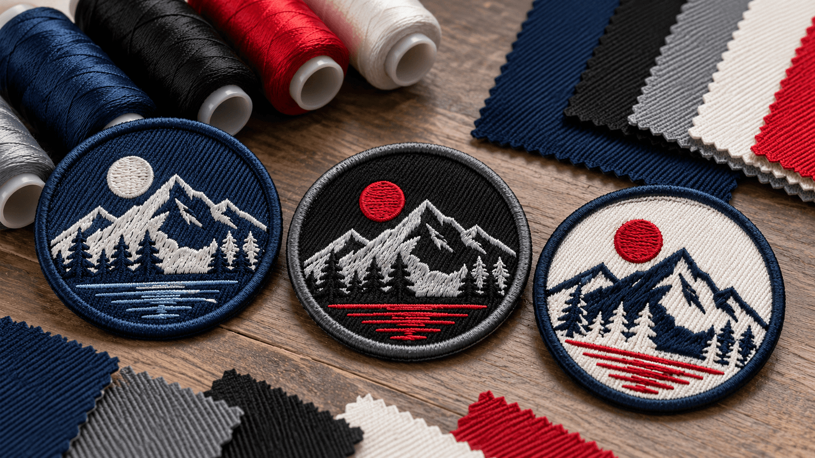
That is because patch thread color matching is not the same as copying a digital color value from a screen. Embroidery thread has texture and sheen, twill has its own surface and background tone, and lighting changes how both are perceived.
For buyers, the practical approach is to provide the strongest color references available, understand where physical materials can vary from screen colors, and review the proposed color combination before production.
For a broader overview of embroidered patch construction, see our Custom Embroidered Patch Guide.
Why Screen Colors and Patch Colors Can Look Different
A logo on your monitor is created with light.
An embroidered patch is created from physical materials.
Those are two different color environments.
A screen can display very bright blues, saturated reds, glowing greens, and smooth gradients. Thread must reproduce that appearance using available physical colors.
The result may look very close without being visually identical under every condition.
Several factors affect what you see:
- Screen calibration
- Screen brightness
- Thread color
- Thread sheen
- Stitch direction
- Twill background
- Nearby colors
- Room lighting
- Daylight
- Garment color
This is why choosing patch colors only by looking at a phone screen can be risky when brand color accuracy is important.
Start With the Best Color Reference You Have
Not every buyer has a formal brand manual.
That is fine.
Use the strongest available reference.
Best: Approved Brand Color Reference
If your organization already uses defined brand colors, provide them with the artwork.
Useful references can include:
- Pantone references
- Brand style guide
- Approved print specifications
- Existing embroidery reference
- Approved physical branded product
A named reference is more useful than saying:
“Use the blue from our website.”
Good: Original Logo Artwork
A high-quality logo file can still provide useful guidance.
Try to provide the original artwork rather than:
- Screenshot
- Social media image
- Compressed JPEG
- Photo of a monitor
The cleaner the source, the easier it is to understand which colors are intentional.
For more preparation guidance, see How to Prepare Artwork for Custom Patches.
Thread Has Sheen
Embroidery thread does not behave like flat printed ink.
Its surface reflects light.
This gives embroidered patches their distinctive texture, but it also means a thread color can appear:
- Lighter from one angle
- Darker from another
- Brighter under direct light
- Softer under indoor lighting
The effect can become more noticeable on larger stitched areas.
For example, a navy thread may appear richer under warm indoor light and cooler under daylight.
The thread itself has not changed. The way light interacts with the surface has.
Stitch Direction Can Change How the Same Color Looks
One of the less obvious parts of embroidery color is stitch direction.
Two sections can use the same thread color but appear slightly different because the stitches run in different directions.
Light hits each section differently.
That effect can actually help an embroidered design.
For example, different stitch directions can make:
- Letters stand apart from a background
- Adjacent shapes feel more dimensional
- A mascot look more structured
- Geometric areas appear distinct
So when reviewing embroidered colors, remember that the final appearance depends on both the thread color and how the thread is stitched.
Twill Is Part of the Color Palette
Not every embroidered patch covers the entire face with thread.
When the base fabric remains visible, the twill color becomes an important part of the design.
Imagine a patch with:
- Navy twill background
- White lettering
- Red embroidered symbol
The navy is not just a construction material.
It is one of the three main visible colors.
If the twill changes from deep navy to royal blue, the whole patch feels different even if the thread colors stay exactly the same.
That makes twill selection particularly important for patches with partial embroidery coverage.
Thread Color and Twill Color Do Not Need to Match
Sometimes the goal is contrast rather than matching.
For example:
Black twill + white thread creates strong visual separation.
Navy twill + light blue thread creates a more subtle tonal appearance.
Red twill + red thread may create a near-monochrome effect depending on the shades selected.
Choose the relationship intentionally.
Ask whether the background should:
- Disappear behind the design
- Contrast with the design
- Match the garment
- Reinforce a brand color
- Create a neutral base
This is often more useful than asking whether the thread and fabric are technically the same color.
Contrast Matters More Than Tiny Color Differences
For many patches, readability is more important than extremely small shade differences.
Consider a dark blue background with slightly lighter blue text.
The colors may both match the brand palette, but the lettering could still be difficult to read.
A better combination may use stronger contrast.
This is especially important for:
- Small lettering
- Names
- Department patches
- Border text
- Numbers
- Compact logos
Color accuracy and legibility should work together.
Use Color Roles, Not Just a List of Colors
A useful patch brief should identify what each color actually does.
For example:
Background: Navy
Company name: White
Icon: Red
Border: Navy
Secondary line: Light gray
This reduces ambiguity.
Sending a list that simply says:
Navy, white, red, gray
does not explain where each color belongs.
The more specific your color instructions are, the easier it is to review the proof later.
What Happens With Gradients?
Gradients are common in digital logos but are more complicated in traditional embroidery.
A smooth digital transition may use dozens or hundreds of color values.
Embroidery uses physical thread colors.
Depending on the design, a gradient may need to be:
- Simplified
- Converted into color blocks
- Reinterpreted with stitch direction
- Reproduced with another patch method
If a gradient is central to your artwork, discuss it before approving the embroidered version.
A woven or sublimated patch may sometimes make more sense when subtle color transitions are essential.
Named Colors Are Helpful, but They Are Still References
A formal named color gives everyone a clearer target.
However, a physical embroidery thread may not reproduce every printed or digital reference identically.
That does not make the reference useless.
It gives the supplier a defined starting point.
Think of it as:
“This is the brand color we are trying to reproduce as closely as the chosen material allows.”
rather than:
“Every material will look exactly identical to this value.”
This distinction is especially important when the same logo appears across print, digital, embroidery, PVC, and fabric products.
Lighting Can Change Your Judgment
Color should be reviewed in realistic conditions whenever possible.
A patch can appear different under:
- Warm office lighting
- Cool fluorescent light
- Window light
- Direct sunlight
- Photography lighting
If color is critical, avoid making a final judgment under one unusual light source.
Neutral daylight can provide a useful reference, but the final patch may still be seen under many different conditions.
The goal is consistent brand recognition—not forcing one shade to appear visually identical in every environment.
What a Digital Proof Can Show Well
A proof is useful for checking:
- Which color goes where
- Overall color balance
- Correct logo version
- Background color
- Border color
- Layout
- Shape
- Text
- Contrast
It helps confirm the color assignment.
For example, you can verify that:
- The icon is red
- The text is white
- The background is navy
- The border is navy
That is valuable.
What a Digital Proof Cannot Guarantee
A screen proof cannot perfectly reproduce:
- Thread sheen
- Twill texture
- Stitch direction
- Physical surface reflection
- Every lighting condition
- Exact monitor-to-material color appearance
Two people can even view the same proof on different devices and see slightly different shades.
So if a color is unusually sensitive, do not rely only on how it appears on one screen.
When a Physical Reference Matters
A physical reference can be helpful when color consistency is especially important.
Examples include:
- Corporate uniforms
- Established brand programs
- Repeat retail products
- Team identity
- Large recurring orders
- Existing embroidered merchandise that must be matched
A physical reference may include:
- Existing approved patch
- Fabric sample
- Branded garment
- Color swatch
Whether PatchesOrder accepts physical references, provides stitch-outs, or offers production samples should be confirmed directly before promising those options.
A Practical Color-Matching Workflow
Instead of trying to make color selection complicated, use this sequence.
1. Supply the Original Artwork
Avoid screenshots when a better file exists.
2. Identify Important Brand Colors
Clearly state which colors must remain recognizable.
3. Add Named References if Available
Include Pantone or other approved brand references when you have them.
4. Identify the Background
State whether the background should be twill or embroidered thread where relevant.
5. Check Contrast
Make sure text, icons, and borders remain readable.
6. Review the Proof
Confirm that every color is assigned to the correct element.
7. Ask About Physical Matching When Necessary
For color-critical projects, confirm what matching or sample options are actually available.
Color Checklist Before Approval
Before approving an embroidered patch, check:
- Correct logo version
- Correct background color
- Correct thread colors
- Sufficient contrast
- Correct border color
- Correct text color
- Important brand references supplied
- No unexpected color substitutions
- Gradient handling understood
- Twill color confirmed where visible
- Any color-critical requirements discussed
If these points are clear, you are in a much better position to approve the design confidently.
Matching Colors Across Repeat Orders
Repeat-order consistency becomes easier when you save the approved specification.
Keep:
- Artwork
- Proof
- Thread color references
- Twill color
- Border color
- Patch dimensions
- Patch type
- Internal design reference
Do not rely on instructions such as:
“Use the same blue as last time.”
Keep the actual approved record whenever possible.
This is especially useful for uniforms, teams, businesses, clubs, and other buyers who reorder the same design regularly.
Color Matching Is About Consistency, Not Just Codes
Good patch color matching is not simply about finding a number.
It is about managing the relationship between thread, twill, artwork, contrast, light, and the intended brand appearance.
Start with strong artwork and clear color references. Treat visible twill as part of the design. Remember that thread has texture and sheen. Use the proof to confirm color placement, but understand its limits as a screen representation.
For projects where exact visual matching is especially important, ask what physical color-reference or sample process is available before production.
Ready to create your design?
Explore Custom Embroidery Patches and request a free quote with your artwork, size, quantity, preferred colors, and any brand references you want considered.
Frequently Asked Questions
Can embroidery thread exactly match a digital logo color?
Not always. Digital colors are produced with light, while embroidery uses physical thread. A named color reference can provide a target, but the physical result may appear different depending on material and lighting.
What is the difference between thread color and twill color?
Thread forms the embroidered design, while twill is the fabric base beneath it. If the twill remains visible, its color becomes part of the finished patch.
Should I provide Pantone colors for a patch?
If you already have approved Pantone references, include them. They can help communicate the intended brand color, but confirm how the actual thread-matching process is handled for your order.
Why does embroidery look different under different light?
Thread has a reflective surface. Its sheen, stitch direction, and surrounding colors can make the same thread appear lighter or darker under different lighting.
Can I approve exact color from a digital proof?
A digital proof is useful for confirming color placement and general appearance, but it cannot perfectly reproduce physical thread, twill texture, sheen, or every lighting condition.
Can I send an existing patch as a color reference?
A physical reference may be useful for color-sensitive projects. Confirm directly whether PatchesOrder accepts physical samples or offers a specific matching process before sending one.
