
Small text is one of the hardest details to reproduce cleanly on an embroidered patch.
A company tagline may look perfectly sharp on a computer screen. A department name may fit neatly around a digital badge. A website address may seem readable when the artwork is enlarged.
But embroidery is made with physical thread and stitches, not pixels.
Once those letters become too small, narrow openings can close, individual strokes can merge, and words that looked clear on screen can turn into a dense line of thread.
So how small can embroidered text actually be?
As a practical starting point, aim for lettering around 0.25 inch (about 6 mm) tall or larger for embroidered patches. Larger text—around 0.3 inch or more—often gives you more room for clear, dependable lettering.
That is not a universal guarantee.
The real limit depends on:
- Font
- Letter height
- Stroke thickness
- Uppercase vs. lowercase
- Spacing
- Patch dimensions
- Number of characters
- Thread construction
- Background contrast
- Digitizing
- Overall design complexity
This guide explains how those factors affect embroidery lettering and what to do when your logo contains text that is simply too small for traditional embroidery.
If you want the classic raised stitched look, start with Custom Embroidery Patches.
How Small Can Embroidered Text Be?
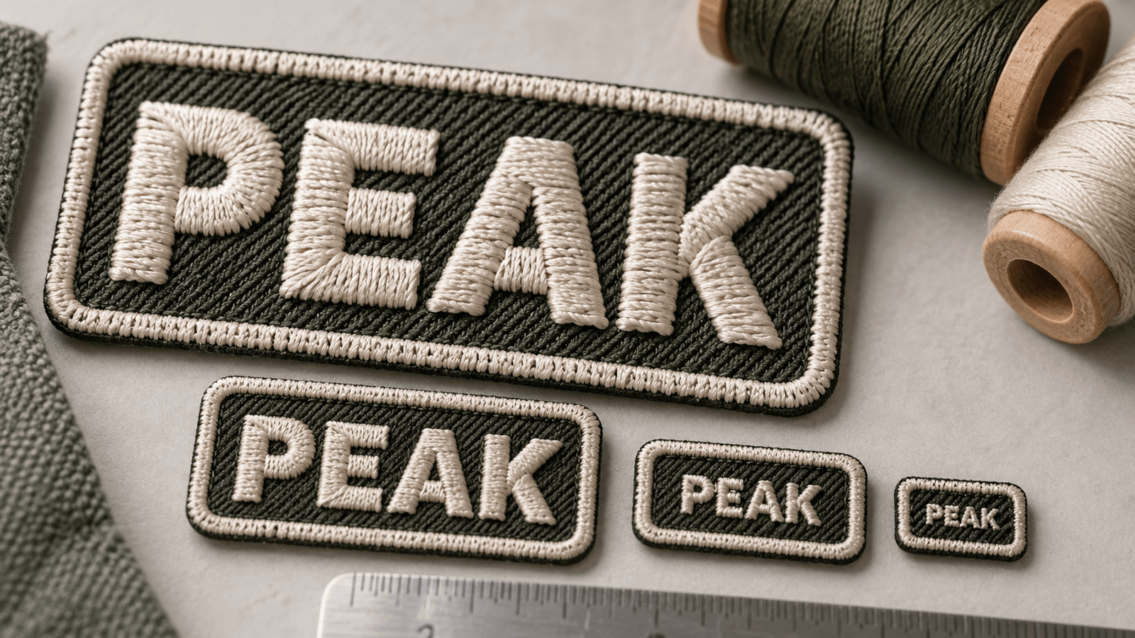
For most custom embroidered patch designs, about 0.25 inch / 6 mm in letter height is a useful lower starting point for readable text.
For important lettering such as:
- Names
- Company names
- Departments
- Units
- Identification
- Safety wording
- Team names
going slightly larger can provide more reliable readability.
But letter height alone does not tell the whole story.
For example, these two words could have the same overall height:
SECURITY
and
Signature
yet behave very differently when embroidered.
The first can use thick, open block lettering.
The second may use thin strokes, loops, joins, and small internal spaces.
That is why the better question is:
Can this specific typeface remain recognizable when converted into stitches at the finished patch size?
Why Small Embroidered Text Has a Physical Limit
Digital artwork can display extremely thin lines because screens use tiny pixels.
Embroidery works differently.
A letter has to be converted into a sequence of stitches that occupy physical space.
Every character needs enough room for:
- Vertical strokes
- Horizontal strokes
- Curves
- Corners
- Interior openings
- Space between letters
When those elements are squeezed too tightly, the thread begins competing for the same physical area.
The result can be:
- Filled-in letters
- Blurred edges
- Closed counters
- Merged characters
- Uneven spacing
- Distorted shapes
Making the original image higher resolution does not solve this problem.
A 5,000-pixel-wide logo can still contain lettering that is too physically small when the final patch measures only two inches.
Screen Size Is Not Patch Size
This is one of the biggest reasons small text fails.
Imagine a 3-inch patch displayed 12 inches wide on your computer monitor.
At that zoom level, every letter looks easy to read.
But the customer will not receive a 12-inch digital image.
They will receive a 3-inch physical patch.
Text should therefore be evaluated according to the finished dimensions.
A useful test is to display or print your artwork at approximately its actual production size.
If the lettering already feels cramped before it becomes thread, embroidery will not make it clearer.
Letter Height Matters More Than Font Point Size
Do not rely on a design program’s font size alone.
A 14-point font in one typeface may have completely different visible letter dimensions from a 14-point font in another.
For embroidery, the important measurement is the actual physical height of the stitched letters.
Two fonts set to the same point size may have different:
- Capital heights
- Lowercase heights
- Stroke widths
- Internal openings
- Spacing
Measure what will actually appear on the patch.
Uppercase vs. Lowercase Embroidered Text
Capital letters often work well on patches because their shapes can be relatively simple and consistent.
Examples:
FIRE
RESCUE
TEAM 24
SECURITY
However, uppercase lettering can also require slightly more vertical space if clarity is important.
Lowercase letters create another challenge because many characters contain smaller internal details.
Consider:
company
Letters such as:
- a
- e
- o
- p
- g
contain openings that need to remain visible.
If the letters become too small, those interior spaces can close.
So a nominal text height that works for one all-caps word may not produce the same result for a lowercase phrase.
The Hidden Problem: Counters
In typography, the enclosed or partially enclosed space inside a letter is called a counter.
Examples include the open areas inside:
- A
- B
- D
- O
- P
- R
- e
- a
These spaces are critical to recognizing the character.
Take the letter:
O
If thread fills most of the center, it can begin to look like a solid dot.
The same issue affects:
B
If the two internal spaces close, the character loses definition.
For small embroidered text, preserving those negative spaces is often more important than matching every detail of the original typeface.
Stroke Thickness Matters
A letter can technically be tall enough but still fail because its strokes are too thin.
Consider two fonts:
BOLD BLOCK
versus a very light fashion font.
Both may be 0.3 inch tall.
But the bold font gives the embroidery enough physical width to form stable strokes.
The light font may contain hairline elements that are difficult to reproduce cleanly with thread.
For very small embroidery, prioritize clear stroke structure over delicate typography.
Best Font Styles for Small Embroidered Text
Simple typefaces generally perform better at small sizes.
Good candidates often include:
- Bold sans-serif
- Block lettering
- Simple condensed lettering
- Clean uppercase typography
- Fonts with open counters
Characteristics to look for include:
Consistent strokes
Letters should not jump between extremely thick and extremely thin elements.
Open shapes
Letters such as A, B, O, P, R and e need enough internal space.
Simple terminals
Extra flourishes consume valuable space.
Moderate width
Extremely compressed characters can merge together.
The goal is not to choose the plainest font possible.
It is to choose a typeface whose important shapes can survive being converted into stitches.
Fonts That Become Risky at Small Sizes
Some styles need substantially more room.
Thin Fonts
Hairline strokes may need to be thickened during digitizing.
Script Fonts
Loops, joins and decorative curves can become congested when reduced.
Ornamental Fonts
Decorative edges can disappear or merge.
High-Contrast Serif Fonts
Very thin serif details may not reproduce proportionally at small sizes.
Extremely Condensed Fonts
Narrow characters leave less room for internal openings and spacing.
These fonts are not automatically unsuitable for embroidery.
They simply need more physical space than a simple block font.
Is All-Caps Better for Embroidered Patches?
Often, yes—particularly for identification.
All-caps lettering is common on:
- Name patches
- Work uniforms
- Security patches
- Tactical identification
- Team patches
- Department patches
because straightforward capital forms can remain readable at relatively compact sizes.
For example:
MAINTENANCE
may be easier to structure cleanly than a decorative mixed-case version of the same word.
But all-caps does not magically remove embroidery limits.
Long words still need enough width.
Character Count Changes Everything
A 3-inch-wide patch can comfortably accommodate:
ACE
more easily than:
INTERNATIONAL SERVICES
even if both use the same letter height.
Longer wording forces one of three things to happen:
- The letters become smaller.
- The patch becomes wider.
- The wording wraps onto additional lines.
If readability matters, shrinking the text should usually be the last option.
Consider shortening nonessential wording or increasing the available space.
One Line vs. Two Lines
Suppose your patch needs to say:
NORTHWEST SECURITY
Trying to place the entire phrase on one narrow line may require very small letters.
A two-line treatment:
NORTHWEST
SECURITY
can provide significantly more letter height without making the patch wider.
Line breaks are therefore a useful design tool.
But adding too many lines creates the opposite problem.
A small patch containing four or five lines of text can quickly become crowded.
Letter Spacing Can Save Small Text
Characters need separation.
If letters are positioned too closely, adjacent stitches can visually merge.
For example:
RN
can begin looking like:
M
if the spacing becomes too tight.
Similarly:
CL
can become difficult to distinguish when squeezed together.
Slightly increasing letter spacing can improve readability even without increasing the actual letter height.
This is especially useful for:
- Acronyms
- Short names
- Unit identifiers
- Block lettering
Word Spacing Matters Too
Consider:
FIREDEPARTMENT
versus:
FIRE DEPARTMENT
Clear separation helps the eye recognize each word.
Do not sacrifice every gap merely to force more text into a small patch.
If you are running out of space, reconsider the wording or overall dimensions rather than compressing everything until it becomes unreadable.
Curved Text Has Less Usable Space Than Straight Text
Many badge designs place wording around the top or bottom of a circle.
For example:
CITY FIRE DEPARTMENT
following an arc.
Curved text can require more space than a straight line because each character must follow the radius.
As the circle becomes smaller:
- Letters rotate more sharply.
- Available arc length decreases.
- Interior spacing becomes tighter.
This is why small circular patches with long border text are particularly challenging.
If the wording is essential, increasing the diameter may produce a cleaner result.
Small Text Around a Border
Text around the edge of a patch can look excellent when the design has enough room.
But border lettering competes with:
- Outer edge
- Border stitching
- Central logo
- Inner spacing
A patch containing both:
long circular wording
and
a detailed center emblem
can become crowded very quickly.
Instead of shrinking every element, decide which part needs visual priority.
Contrast Affects Readability
Small lettering needs visual separation from its background.
For example:
White thread on black fabric
usually provides stronger visual contrast than:
Dark navy thread on black fabric
Even technically well-formed letters can become difficult to read when foreground and background colors are too similar.
Strong contrast matters particularly for:
- Uniform identification
- Name patches
- Team names
- Small slogans
- Department wording
Think about thread color and background as a pair rather than choosing each independently.
Embroidery Coverage Does Not Fix Small Text
Adding more embroidery to the patch does not make tiny lettering clearer.
Embroidery coverage refers to how much of the patch surface is stitched.
Text legibility depends on the physical geometry of the letters.
A fully embroidered background can actually require careful contrast so the small foreground lettering remains distinct from surrounding stitches.
Treat coverage and letter size as separate decisions.
Does a Larger Patch Make Small Text Easier?
Usually, because it gives you more space to make the lettering physically larger.
But increasing the patch size only helps if the text itself is also enlarged.
For example:
A 2-inch patch containing 0.18-inch lettering may be difficult.
Scaling the entire artwork proportionally to 3 inches increases the text too, which may move it into a much safer range.
This is one reason complex designs often work better at larger dimensions.
Small Text on Hat Patches
Hat patches are particularly challenging because the available surface is limited.
A front patch may need to fit between:
- Crown seams
- Bill
- Curvature
- Existing branding
That limited area can tempt designers to shrink a company tagline or secondary text too far.
If your hat logo contains:
Brand Name
Long descriptive tagline underneath
the tagline may become the limiting factor.
Possible solutions include:
- Removing the tagline
- Increasing the patch width
- Using simpler lettering
- Switching to woven construction
- Creating a hat-specific version of the logo
For more headwear-specific considerations, see the Custom Hat Patches Guide.
Small Text on Uniform Patches
Uniform wording often carries actual information.
Examples include:
- Employee names
- Departments
- Ranks
- Units
- Organization names
- Locations
That makes readability more important than decorative fidelity.
For identification patches, give the wording enough space to be recognized quickly.
Do not shrink critical information simply to preserve an overly complex badge layout.
For military-style applications, our Army Unit Patches Guide discusses how embroidered, woven and PVC materials handle unit-style designs.
Small Text on Name Patches
Name patches are a perfect example of why word length matters.
Compare:
LEE
with:
CHRISTOPHER
Using identical dimensions may force the longer name into much smaller lettering.
For variable employee-name orders, design the patch around the longest realistic name rather than the shortest example.
You can also use:
- Slightly wider patch dimensions
- A moderately condensed block font
- Consistent capital letters
to preserve readability across different names.
What Happens During Embroidery Digitizing?
An embroidery machine does not simply “print” your vector or PNG with thread.
The artwork must be interpreted as stitches.
For lettering, the digitizing process can involve decisions about:
- Stitch direction
- Stitch sequence
- Underlay
- Density
- Compensation
- Character spacing
- Stroke thickness
A skilled digitizer may make small adjustments to preserve the visual identity of a letter.
For example, a very thin stroke may need to become slightly thicker.
A small internal opening may need to become slightly larger.
That is normal.
The goal is to create embroidered lettering that looks correct on the finished patch, not to mechanically copy every microscopic feature from the screen.
Why High-Resolution Artwork Cannot Rescue Tiny Text
High-quality artwork is valuable.
But resolution and stitchability are different issues.
Imagine your logo contains a tagline that will physically measure only 0.1 inch high on the finished patch.
Sending that text as:
- AI
- EPS
- SVG
- 4K PNG
does not change its final physical dimensions.
The original artwork may be perfectly sharp while the finished embroidery still lacks enough room to form recognizable letters.
When physical size is the problem, you need to change:
- Letter size
- Layout
- Patch dimensions
- Typeface
- Patch construction
—not just file resolution.
When Should You Switch From Embroidered to Woven?
If preserving very small text is more important than achieving the raised texture of embroidery, consider Custom Woven Patches.
PatchesOrder specifically positions woven patches for:
- Small lettering
- Fine details
- Intricate logos
- Clean lines
because woven patches use finer threads and have a smoother surface.
That gives detailed typography more room to remain visually distinct.
The trade-off is appearance.
Embroidered
Choose embroidery when you want:
- Raised stitching
- Traditional patch texture
- Bold lettering
- Classic emblems
Woven
Consider woven when you prioritize:
- Smaller text
- Fine lines
- Detailed logos
- Smooth finish
Read the full Woven vs. Embroidered Patches comparison if text detail is affecting your material choice.
When Should You Consider Sublimation Instead?
Some designs contain typography or visual detail that goes beyond what thread-based construction can reproduce comfortably.
For example:
- Very fine printed text
- Dense illustrations
- Complex gradients
- Photo-style artwork
- Tiny graphic details
In those situations, Custom Sublimation Patches may be worth considering.
Sublimation uses a printed surface rather than building every visual element from raised embroidery stitches.
That gives you a different appearance, but it can be more appropriate when very fine printed detail is essential.
Embroidered vs. Woven vs. Sublimated Text
| Feature | Embroidered | Woven | Sublimated |
|---|---|---|---|
| Surface | Raised and textured | Smooth woven thread | Smooth printed surface |
| Bold lettering | Excellent | Excellent | Excellent |
| Small lettering | More limited | Better suited | Very high detail possible |
| Fine lines | More limited | Strong | Strong |
| Traditional patch look | Strongest | Moderate | Printed appearance |
| Best reason to choose | Texture and classic embroidery | Fine thread detail | Complex printed detail |
This does not mean you should always switch materials when your text is small.
First decide which part of the design matters most:
embroidered texture or tiny detail?
How to Improve Small Embroidered Text Without Changing Patch Type
If you want to keep embroidery, try improving the typography before switching materials.
Make the Letters Taller
Even a small increase can create substantially more stitchable space.
Increase Stroke Thickness
Replace thin lettering with a stronger weight.
Open Tight Counters
Make the internal spaces in letters more generous.
Increase Character Spacing
Give adjacent letters room to remain visually separate.
Shorten the Wording
Remove unnecessary secondary text.
Use Multiple Lines
Reorganize long phrases instead of compressing them.
Increase Contrast
Choose thread and background colors that separate clearly.
Simplify the Typeface
Remove decorative features that do not survive embroidery well.
Before and After Example
Imagine a 3-inch circular patch with this border text:
NORTHWEST PROFESSIONAL LANDSCAPING SERVICES
The designer wants it around the outer edge.
At that size, the wording may need to become extremely small.
Instead, the design could use:
NORTHWEST LANDSCAPING
around the border and move any additional information elsewhere.
The revised version may be:
- Easier to embroider
- Easier to read
- Cleaner visually
- More recognizable from a distance
Good patch design often involves editing, not just shrinking.
The Small-Text Survival Test
Before approving embroidered lettering, ask five questions.
1. Can I Read It at Actual Size?
View the design at its intended physical dimensions.
Do not zoom.
2. Are the Letter Strokes Strong Enough?
Check for thin lines that may disappear or require modification.
3. Are the Interior Openings Visible?
Look at A, B, D, O, P, R, a and e.
4. Are Adjacent Letters Separate?
Pay attention to tight combinations such as RN, CL, MM and NN.
5. Is the Text Essential?
If a tiny tagline contributes little to the patch, removing it may create a better result.
If the answer to several of these questions is no, enlarge or simplify the text before production.
Why a Digital Proof Matters for Small Lettering
PatchesOrder provides a digital proof before production.
For text-heavy artwork, use that stage carefully.
Check:
- Spelling
- Letter size
- Font style
- Line breaks
- Character spacing
- Word spacing
- Curved lettering
- Text-to-background contrast
- Overall balance
Also check every small:
- Number
- Date
- Initial
- Abbreviation
A missing character is much easier to fix before production than after the patches have been manufactured.
Do Not Approve Text Just Because You Know What It Says
This sounds obvious, but familiarity can hide readability problems.
If you already know the wording is:
NORTH DIVISION
your brain can recognize a blurry version more easily than someone seeing it for the first time.
Ask another person to look at the proof at actual size without telling them what the text says.
If they struggle to read it, consider enlarging or simplifying the lettering.
A Practical Text Decision Guide
Use this simple framework.
Text Is Bold, Short and Around 0.25 Inch or Larger
Embroidered patches are a strong candidate.
Explore Custom Embroidery Patches.
Text Is Small but Fine Thread Detail Is Essential
Consider woven construction.
Explore Custom Woven Patches.
Text Is Extremely Fine and Part of Complex Printed Artwork
Consider sublimation.
Explore Custom Sublimation Patches.
You Are Not Sure Which Construction Fits
Browse all Custom Patches and submit the artwork for review rather than guessing.
What Is the Best Letter Size for an Embroidered Patch?
There is no single perfect size.
But there is an important difference between:
minimum possible
and
comfortable reading size.
The smallest technically producible lettering is not necessarily the lettering you should choose.
If the patch carries important identification, branding or instructions, giving the text extra space is usually better than designing directly against the production limit.
Treat approximately 0.25 inch / 6 mm as a practical starting point rather than a target you need to hit.
If you have room for larger lettering, use it.
Create Embroidered Text That People Can Actually Read
Small embroidered text is a design problem before it becomes a production problem.
The goal is not to squeeze the maximum number of characters into the smallest possible area.
The goal is to create lettering that remains recognizable once digital artwork becomes physical thread.
For better embroidered text:
- Give letters enough height.
- Use clean typefaces.
- Avoid unnecessarily thin strokes.
- Leave space between characters.
- Preserve interior openings.
- Use strong contrast.
- Keep secondary wording under control.
- Review the design at actual size.
If those requirements cannot be met without compromising the logo, consider another patch construction instead of forcing the artwork into embroidery.
PatchesOrder offers Custom Embroidery Patches for traditional raised lettering as well as Custom Woven Patches for designs where finer lettering and intricate details are a priority.
You can also browse all Custom Patches for additional material options.
For patches going on uniforms, jackets, shirts and other apparel, explore Custom Clothing Patches.
Have a logo with small lettering and aren’t sure whether it will work?
Request a Free Quote from PatchesOrder and submit the actual artwork for review.
Frequently Asked Questions About Small Text on Embroidered Patches
What is the minimum text size for an embroidered patch?
Approximately 0.25 inch, or about 6 mm, in letter height is a useful practical starting point for embroidered text. The actual workable size depends on the font, stroke thickness, spacing, capitalization, patch dimensions and digitizing.
Can embroidery text be smaller than 0.25 inch?
Some lettering may be technically possible below that size depending on the exact characters and construction, but readability becomes increasingly risky. Instead of treating 0.25 inch as an absolute machine limit, use it as a practical design threshold and have the actual artwork reviewed.
Is 0.25-inch text guaranteed to be readable?
No. A thin decorative font can perform worse than a bold block font at the same height. Letter height, stroke width, counters, spacing and digitizing all influence the result.
What font is best for small embroidered text?
Simple bold or medium-weight sans-serif and block-style fonts usually provide strong readability because they have clear strokes and relatively open letterforms. Very thin, ornate or highly compressed fonts generally need more space.
Is uppercase or lowercase better for embroidery?
Simple uppercase lettering often works well for compact identification text, but both uppercase and lowercase can be embroidered successfully when the letters are large enough. Lowercase designs require particular attention to small counters and fine details.
Why does small embroidery text become blurry?
Thread occupies physical space. When lettering becomes too small, stitches can overlap, internal spaces can close and adjacent characters can visually merge.
Can high-resolution artwork make tiny embroidered text readable?
Not by itself. High-resolution artwork provides a better source file, but embroidery is still limited by the physical dimensions of thread and stitches at the final patch size.
Are woven patches better for small text?
They can be. Custom Woven Patches use finer threads and a smoother construction, making them well suited to small lettering, fine lines and intricate logos.
Should I use woven instead of embroidered patches for a detailed logo?
If fine lettering and intricate line work are more important than the raised texture of embroidery, woven construction may be the better fit. Compare both options in our Woven vs. Embroidered Patches Guide.
Can a tagline fit on an embroidered patch?
Yes, if the patch provides enough room for the tagline to remain readable. Long taglines on small patches may need to be enlarged, shortened, moved to another line or removed.
Does increasing patch size help small text?
Yes, when the artwork is scaled proportionally. Increasing the overall patch dimensions can give letters more physical space and improve readability.
Can small curved text be embroidered?
Yes, but curved wording usually needs enough diameter and spacing for each letter to remain distinct. Long phrases wrapped around small circular patches can become difficult to reproduce cleanly.
Are embroidered name patches good for small lettering?
Yes, particularly when the name uses clear block lettering and enough height. Longer names may require wider patch dimensions so the lettering does not need to be reduced excessively.
What if my logo must keep very tiny text?
Consider whether the tiny wording is essential. If it cannot be enlarged or simplified, Custom Woven Patches or Custom Sublimation Patches may provide a more suitable method for preserving fine detail.
Will PatchesOrder show me the design before production?
Yes. PatchesOrder provides a digital proof for review before production, allowing you to check the lettering, artwork and overall layout before approving the order.
