Most embroidered patch problems start before the first stitch is made.
Tiny lettering, hairline details, weak color contrast, unsuitable borders, and the wrong attachment method can all make a strong digital design perform poorly as a physical patch.
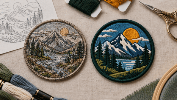
The easiest way to avoid these issues is to judge the artwork as embroidery, not just as a logo on a screen.
The most common embroidered patch design mistakes are:
- Making text too small
- Using extremely thin lines
- Keeping too much detail
- Choosing low-contrast colors
- Expecting embroidery to reproduce smooth gradients
- Using the wrong border for the shape
- Choosing backing without considering the garment
- Finalizing the patch without checking placement
For a complete overview of embroidery design, coverage, backing, and construction, start with the Custom Embroidered Patch Guide.
Mistake 1: Making the Text Too Small
A tagline may look perfectly readable while the artwork fills your laptop screen.
The problem appears when that same design becomes a small embroidered patch.
Thread has physical thickness. As letters become smaller, narrow spaces can close and individual strokes can begin to merge.
Why It Causes Problems
Small embroidered lettering becomes harder to reproduce when the design uses:
- Thin fonts
- Tight letter spacing
- Narrow lowercase characters
- Long wording
- Curved text
- Small counters inside letters
Trying to preserve every word often makes the patch harder to read.
Better Approach
Identify which wording is actually essential.
Consider:
- Increasing the patch size
- Shortening the text
- Using a simpler font
- Increasing spacing
- Removing a tagline
- Switching to woven construction if very fine lettering is important
The goal is not to fit the maximum amount of text into the patch. It is to make the important text readable.
See How Small Can Text Be on an Embroidered Patch? for a deeper look at lettering limitations.
Mistake 2: Using Hairline Details
Extremely thin lines are another common problem when digital artwork is translated into stitches.
A fine outline that looks elegant in a vector logo may be too delicate to remain equally clear in embroidery.
Why It Causes Problems
Thin elements can lose definition when surrounded by:
- Dense embroidery
- Borders
- Adjacent colors
- Small gaps
- Other fine details
This can affect:
- Logo outlines
- Mascot facial features
- Decorative lines
- Small icons
- Fine lettering strokes
Better Approach
Decide whether the line is necessary for recognizing the design.
If it is important, it may need to be strengthened.
If it is decorative, removing it may create a cleaner patch.
This is one reason embroidery artwork often requires interpretation during digitizing. Read How Patch Digitizing Changes Your Design for more on stitch paths, density, direction, and simplification.
Mistake 3: Trying to Preserve Every Detail
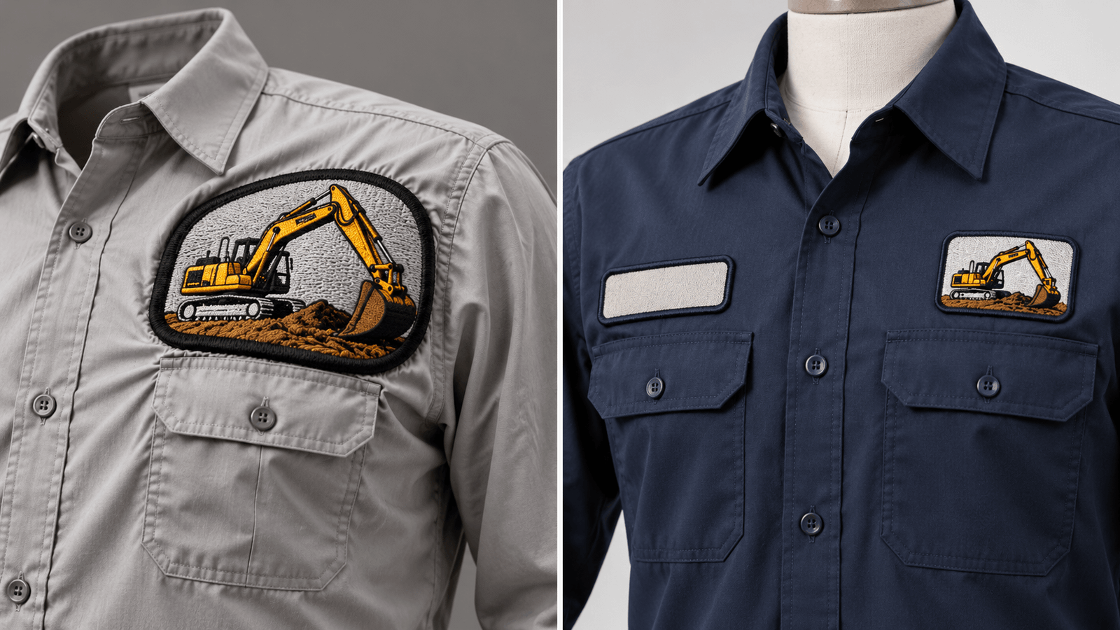
More detail does not always create a better embroidered patch.
Digital logos may contain:
- Shadows
- Textures
- Tiny symbols
- Multiple outlines
- Secondary wording
- Fine highlights
- Background decorations
When all of those elements are forced into a small patch, the design can lose its visual hierarchy.
Why It Causes Problems
The main logo should be the first thing people recognize.
If every element competes for space, important shapes can disappear inside visual clutter.
A detailed mascot, for example, may look better when its strongest characteristics are preserved and very small features are removed.
Better Approach
Ask three questions:
- What makes this design recognizable?
- Which details remain visible at actual patch size?
- Which elements can disappear without changing the identity?
Keep the strongest visual information and simplify the rest.
This is not about making the artwork plain. It is about making each stitched element earn its space.
Mistake 4: Choosing Colors With Weak Contrast
The correct brand colors can still produce a weak patch if they do not separate visually.
For example:
- Dark navy text on black
- Gray lettering on a slightly lighter gray background
- Red details on a similar red twill
may be technically different colors but still difficult to distinguish.
Why It Causes Problems
Contrast affects:
- Small lettering
- Names
- Borders
- Fine symbols
- Logo recognition
Thread also reflects light, so the perceived color can change with stitch direction and lighting.
Better Approach
Evaluate colors as combinations rather than individually.
Ask:
- Does the text separate from the background?
- Is the border visible?
- Can the main symbol be recognized?
- Does the design remain clear from a normal viewing distance?
If brand color accuracy is important, provide approved color references and review the proof carefully.
Our Thread and Twill Color Matching Guide explains how thread sheen, twill, lighting, and screen colors affect the result.
Mistake 5: Expecting Smooth Digital Gradients
Embroidery and digital graphics handle color differently.
A screen can create a smooth gradient using many subtle color transitions.
Traditional embroidery uses physical thread colors.
Why It Causes Problems
Artwork containing:
- Soft shadows
- Photographic shading
- Glow effects
- Complex color fades
may not translate directly into traditional stitched embroidery.
Trying to imitate every digital shade can make the patch unnecessarily complicated.
Better Approach
Depending on the artwork, the gradient may need to become:
- Solid color areas
- Fewer color steps
- Simplified shading
- Stitch-direction effects
If continuous photographic color is essential to the design, consider whether another patch type such as sublimation is more appropriate.
Choose the construction around the artwork rather than forcing every design into embroidery.
Mistake 6: Choosing the Wrong Border for the Shape
The border determines how the finished embroidered patch ends physically.
A thick traditional border can work beautifully on one design and distort another.
Why It Causes Problems
A merrowed border is naturally suited to simple continuous shapes such as:
- Circles
- Ovals
- Rectangles
- Simple badges
It is less suitable for designs containing:
- Narrow points
- Deep cut-ins
- Sharp corners
- Irregular silhouettes
Better Approach
Look at the outside shape before selecting the edge.
A traditional badge may benefit from a raised merrowed border.
A mountain outline, star, animal shape, or angular logo may need a flatter cut edge to preserve the silhouette.
Read Embroidered Patch Borders: Merrowed or Heat-Cut? for the full comparison.
Mistake 7: Choosing Backing Before Thinking About the Garment
Backing should not be selected only because one option sounds convenient.
The patch has to work with the surface where it will actually be used.
Why It Causes Problems
Garments vary in:
- Fabric
- Heat tolerance
- Washing frequency
- Construction
- Flexibility
- Intended use
An attachment method that works on one garment may not be appropriate for another.
For example, heat application requires a compatible material, while removable patches require a suitable hook-and-loop surface.
Better Approach
Start with the application.
Ask:
Does the patch need to stay permanently attached?
Consider sew-on.
Does the fabric safely support heat application?
Iron-on or heat-seal may be an option where suitable.
Does the patch need to be removed or replaced?
Hook-and-loop may make more sense.
Compare the main options in our Patch Backing Types Guide.
Mistake 8: Designing the Patch Without Measuring the Placement
A patch can look excellent by itself but feel too large, too small, or badly positioned once it reaches the garment.
Why It Causes Problems
Usable garment space can be affected by:
- Pockets
- Seams
- Zippers
- Buttons
- Shoulder panels
- Curved hat panels
- Existing embroidery
A patch designed without considering those features may not fit where you originally intended.
Better Approach
Know the intended placement before locking the dimensions.
Use a full-size paper template on the actual garment whenever practical.
Check:
- Available width
- Available height
- Centerline
- Seams
- Pocket clearance
- Hardware
- Visual balance
For repeat orders, record the final position rather than relying on instructions such as “left chest.”
Use our Patch Placement Guide for the full measuring method.
A Better Pre-Approval Check
Before approving an embroidered patch, look at the complete design rather than checking only the logo.
Confirm:
- Text is readable
- Important lines are not too thin
- Unnecessary detail has been removed
- Colors have enough contrast
- Gradients have been handled appropriately
- Border suits the shape
- Backing suits the intended garment
- Final patch dimensions fit the placement
- Spelling is correct
- Overall proportions look balanced
Most importantly, review the design at approximately the size it will actually be produced.
A patch that looks excellent at 500% zoom still needs to work as a physical object.
Simple Designs Often Produce Stronger Embroidery
The purpose of embroidery is not to copy every pixel in a digital file.
It is to translate the most important parts of the design into thread.
Strong embroidered artwork usually has:
- Clear hierarchy
- Readable lettering
- Defined shapes
- Useful contrast
- Suitable edge construction
- A realistic level of detail
Making a design embroidery-friendly does not mean removing its personality.
It means deciding what deserves attention when the artwork becomes physical.
If you are preparing a logo, name, badge, mascot, or emblem, explore Custom Embroidery Patches and request a free quote with your artwork, dimensions, quantity, colors, and intended application.
Frequently Asked Questions About Embroidered Patch Design
What makes a design difficult to embroider?
Very small text, thin lines, crowded details, weak contrast, complex gradients, and extremely intricate shapes can make embroidery harder to reproduce clearly.
Should I simplify my logo for an embroidered patch?
Sometimes. Simplification can improve readability when the logo contains fine details that become difficult to distinguish at the intended patch size.
Why does my embroidered text look different from the digital artwork?
Embroidery uses physical thread rather than pixels. Very small letters or narrow spaces may need adjustment so the wording remains recognizable when stitched.
Can embroidered patches use gradients?
Some shading effects can be interpreted through thread colors or stitch direction, but smooth digital gradients may need simplification. Another patch type may be more suitable if continuous photographic color is essential.
Does the border need to be chosen before production?
Yes. The edge affects the physical shape and appearance of the patch, so the border or cut-edge treatment should be part of the approved design.
How do I know whether my artwork will work as embroidery?
Review the design at its intended size and check lettering, thin elements, contrast, detail, shape, and placement. The artwork may then require digitizing adjustments before production.
