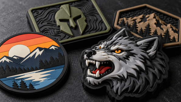
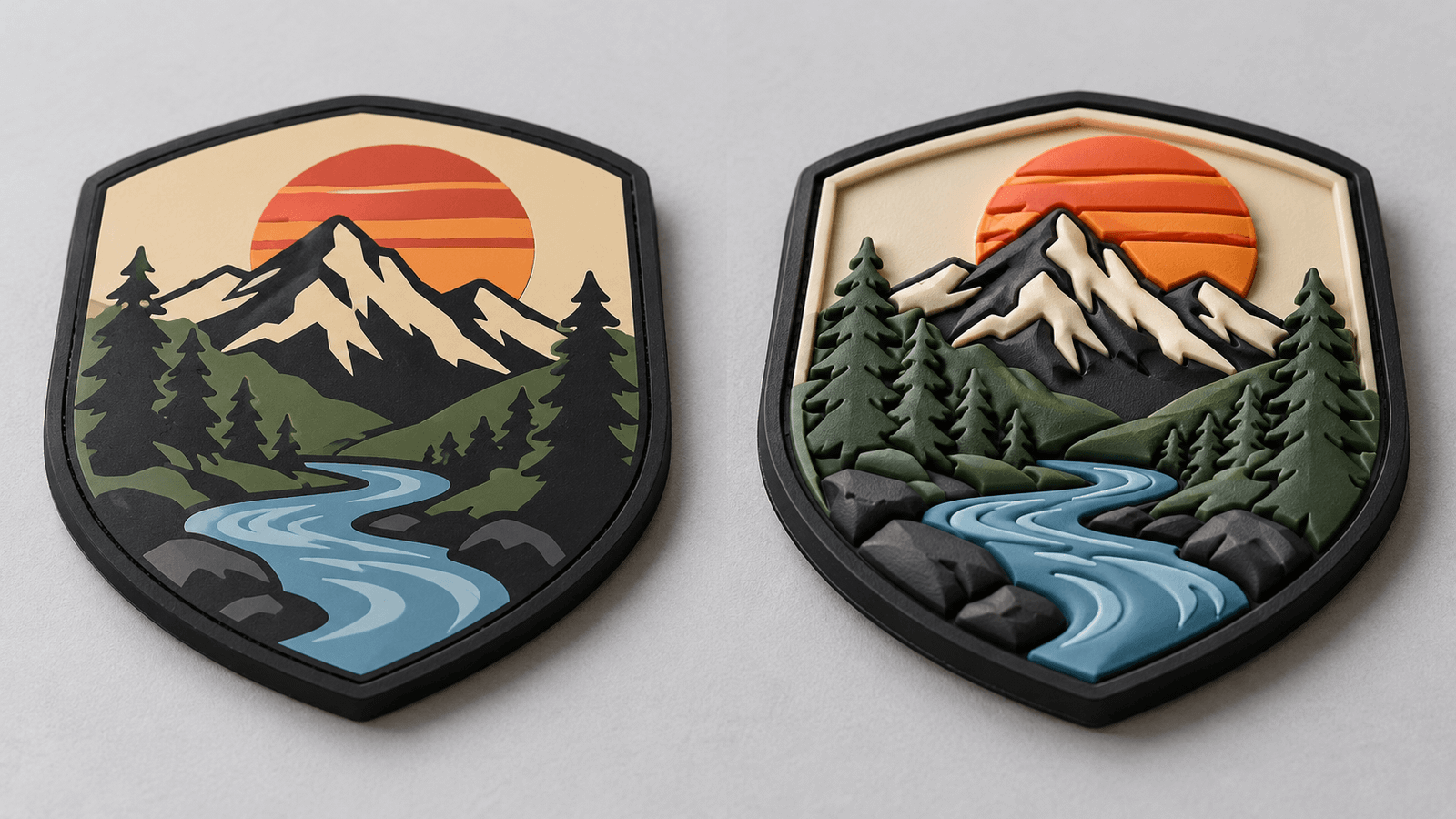
The main difference between 2D and 3D PVC patches is how the artwork uses depth.
A 2D PVC patch uses clean, defined color areas and flat design levels. It works especially well for logos, lettering, badges, icons, and artwork that depends on sharp lines.
A 3D PVC patch uses raised, recessed, or sculpted-looking elements to create stronger depth. It can make mascots, symbols, equipment shapes, lettering, and selected logo elements feel more dimensional.
Neither style is automatically better. The right choice depends on what needs to stay sharp, what needs to stand out, and how much depth supports the design.
If you are still comparing PVC with embroidery, woven, chenille, or other materials, start with the Custom Patch Design Guide.
Think About Depth Before Detail
When buyers hear “3D,” it is easy to assume that more depth means a more premium patch.
That is not always the right way to choose.
Some artwork is strongest when it remains flat and graphic.
Other artwork benefits from physical relief.
Consider these two logos:
Logo A: Bold company initials inside a shield with three solid colors.
Logo B: A detailed animal mascot with a raised face, nose, brows, and outer border.
Logo A may gain very little from extensive 3D shaping. Its strength comes from clean lines and readable lettering.
Logo B may benefit from dimensional areas because depth can help separate the mascot’s major features.
Start with the artwork rather than choosing 3D simply because the option exists.
What Is a 2D PVC Patch?
In PVC patch design, 2D generally refers to artwork built from clearly separated, relatively flat molded areas.
The design can still use different levels to separate elements, but individual surfaces remain visually clean and defined rather than rounded or sculpted.
This works well for designs that depend on:
- Clear lettering
- Geometric shapes
- Bold borders
- Flat icons
- Simple mascots
- Shields
- Flags
- Company logos
- Strong color blocks
The result has a crisp graphic quality.
Why 2D Works Well for Logos
Many brand logos were originally designed as flat graphics.
They rely on:
- Shape
- Typography
- Color
- Negative space
- Alignment
Those elements often translate naturally into 2D PVC.
Imagine a black circular logo containing a white company name and red icon.
A flat construction can preserve the strong separation between those elements without adding unnecessary surface effects.
For corporate logos and identification patches, clarity may be more useful than dimensional complexity.
What Is a 3D PVC Patch?
A 3D PVC patch uses height and relief more visibly as part of the artwork.
Selected elements can appear more raised, recessed, rounded, or dimensional than surrounding sections.
The effect works particularly well when the design contains a visual focal point.
Examples include:
- Mascot faces
- Animal heads
- Skulls
- Equipment
- Symbols
- Raised initials
- Product shapes
- Dimensional emblems
Instead of every area carrying equal visual weight, depth can direct attention toward important elements.
3D Does Not Mean Every Element Should Be Raised
One of the easiest ways to make a 3D design too busy is to give everything the same dimensional treatment.
A stronger approach is often:
Flat background + raised logo
or:
Flat lettering + raised mascot
or:
Raised symbol + recessed surrounding details
This creates hierarchy.
If every letter, border, icon, and background surface competes for depth, the dimensional effect can lose its impact.
Use 3D selectively.
2D vs 3D PVC Patches at a Glance
| Design Factor | 2D PVC | 3D PVC |
|---|---|---|
| Overall appearance | Flat, graphic, defined | Raised, dimensional, sculpted |
| Lettering | Strong choice | Works when depth does not reduce clarity |
| Fine line definition | Generally easier to keep visually clean | May need more space around raised details |
| Logos | Excellent for flat brand marks | Useful for logos designed around depth |
| Mascots | Good for simplified artwork | Useful for prominent facial or dimensional features |
| Color blocks | Very strong | Can combine color with depth |
| Visual hierarchy | Created mainly with shape and color | Created with shape, color, and relief |
| Proof review | Focus on shape, spacing, color | Also review which areas rise or recede |
Readability Should Come Before Depth
PVC is especially effective when design elements remain clearly separated.
This becomes important when adding 3D effects around:
- Names
- Small lettering
- Numbers
- Border text
- Narrow gaps
Depth consumes visual space.
If lettering is already compact, adding raised shapes around it may reduce clarity rather than improve the design.
For text-heavy patches, 2D can often provide a cleaner visual solution.
For 3D patches, give important text enough room so the dimensional areas do not compete with it.
Line Definition Changes With the Design Style
A 2D design is often easier to read as a collection of distinct graphic sections.
For example:
- Dark border
- Light background
- Red lettering
- White icon
Each area has a clear role.
With 3D artwork, the surface structure becomes another design layer.
You need to consider:
- Which element rises?
- Which element stays flat?
- Where does one depth level end?
- Are narrow spaces still visible?
- Does the main shape remain recognizable?
Adding depth should strengthen the outline, not blur it.
Recessed Areas Can Be Just as Useful as Raised Areas
Depth is not only about making something stick outward.
Recessed sections can help define:
- Internal borders
- Lettering
- Background fields
- Icon separation
- Small design divisions
For example, a raised mascot on a flatter background may use recessed lines to separate major facial features.
This can add structure without introducing another color.
The important thing is that the depth has a clear purpose.
Choose 2D When the Logo Already Works as a Graphic
A strong candidate for 2D PVC often has:
- Simple shapes
- Clear outlines
- Limited visual layers
- Bold text
- Distinct color blocks
- Strong silhouette
Examples could include:
- Business logos
- Department identifiers
- Name patches
- Team badges
- Simple morale patches
- Club emblems
If the logo is already easy to recognize in flat print, it may not need additional dimensional treatment.
Choose 3D When Form Is Part of the Idea
A strong candidate for 3D PVC often contains elements where form adds meaning.
For example:
Animal Mascot
Raised brows, snout, nose, or outer facial areas may make the mascot more visually dimensional.
Mountain Emblem
Selected peaks can rise above a recessed background.
Automotive Design
A wheel, grille, emblem, or product silhouette may benefit from controlled relief.
Tactical-Style Symbol
A central icon can be raised while supporting text remains flat and readable.
The goal is not realism.
It is using depth to emphasize the right part of the artwork.
Some Designs Benefit From Combining 2D and 3D
You do not always have to treat the choice as completely separate styles.
PatchesOrder currently states that PVC patches can combine flat 2D areas with raised 3D elements.
That opens a useful design approach:
Keep information flat. Make the focal graphic dimensional.
For example:
- Flat company name
- Flat border
- Raised central icon
This combination can preserve readability while still creating visual depth.
Color Still Matters in 3D
A 3D effect cannot rescue weak color separation.
If two adjacent raised elements use nearly identical colors, they may still blend together.
Good PVC artwork should consider both:
Depth contrast
and
Color contrast
Sometimes depth alone is enough to separate areas.
In other cases, using distinct colors makes the design much easier to understand.
Think about the patch from normal viewing distance, not only in a zoomed digital rendering.
Small Details Need Realistic Expectations
PVC can support defined molded artwork, but it is still a physical product.
Extremely small:
- Text
- Gaps
- Lines
- Recessed channels
- Raised points
may need adjustment depending on the final patch size and production requirements.
Do not respond by making everything 3D.
Instead, simplify where necessary.
If tiny detail is essential to the artwork, review whether the patch size or even the patch material should change.
Shape and Depth Should Work Together
PVC patches can use custom outer shapes.
That means you are making two dimensional decisions:
- What is the outer silhouette?
- What happens inside that silhouette?
A wolf-head patch could use a custom wolf-shaped outline with flat 2D artwork inside.
Or the same outline could contain raised facial features.
A rectangular patch might use 3D lettering even though the outside shape remains simple.
Outer shape and internal depth are separate design choices.
What Should You Review in a 2D Proof?
When reviewing a 2D PVC design, concentrate on:
- Logo proportions
- Color placement
- Lettering
- Border
- Shape
- Spacing
- Element separation
- Backing
- Final dimensions
Make sure the design still reads clearly at the intended physical size.
What Should You Review in a 3D Proof?
For 3D artwork, review everything above plus:
- Which areas are raised
- Which areas are recessed
- Relative depth hierarchy
- Whether important lettering remains clear
- Whether raised areas crowd nearby details
- Whether the focal element is obvious
Do not approve a dimensional design based only on whether it “looks cool.”
Ask what each raised or recessed area is contributing.
Explain the Depth Clearly When Submitting Artwork
If you want a particular 3D effect, provide clear notes.
For example:
Raise: Mountain icon
Keep flat: Brand name
Recess: Inner border
Background: Flat black
That is much more useful than writing:
Make it 3D.
Your artwork and notes should show which parts of the composition deserve dimensional emphasis.
PatchesOrder’s exact allowable depth levels, dimensional measurements, and mold specifications should be confirmed directly for the specific design before publishing or relying on numerical production limits.
When 2D Is the Better Choice
Choose 2D when your priority is:
- Clean typography
- Simple logo reproduction
- Clear color separation
- Strong geometric design
- Easy visual recognition
- A flatter graphic appearance
Do not see this as the “basic” option.
For many logos, it is the more appropriate design choice.
When 3D Is the Better Choice
Choose 3D when your priority is:
- Visible depth
- Raised focal elements
- Sculpted-looking symbols
- Dimensional mascot features
- Stronger surface texture
- Visual separation through relief
Make sure the design has enough room for those features to remain clear.
A Simple Decision Test
Before choosing, look at your artwork and ask:
Would the design still be strong if every element were flat?
If yes, 2D may be all you need.
Is there one specific element that would become more recognizable or visually interesting if raised?
Consider a combined 2D/3D approach.
Does the entire concept depend on form and relief?
A stronger 3D treatment may be appropriate.
That is a better decision process than automatically selecting the option with more depth.
Choose Depth That Supports the Artwork
The difference between 2D and 3D PVC patches is not simply flat versus fancy.
It is about how the design communicates.
2D PVC works well when shape, lettering, borders, and color blocks need to stay crisp and graphic.
3D PVC adds another tool: relief. Raised and recessed areas can emphasize icons, mascots, logos, or other focal details.
The strongest PVC patch uses only as much dimension as the artwork needs.
Explore Custom PVC Patches and request a free quote with your artwork, dimensions, colors, quantity, backing, and whether you prefer a flat 2D, raised 3D, or combined dimensional effect.
Frequently Asked Questions
What is the main difference between 2D and 3D PVC patches?
2D PVC focuses on flat, defined design areas, while 3D PVC uses more visible raised or recessed relief to create dimensional elements.
Are 3D PVC patches better than 2D patches?
Not automatically. 2D is often better for typography, simple logos, and clean graphic artwork. 3D works well when depth improves a mascot, symbol, emblem, or focal element.
Can a PVC patch combine 2D and 3D elements?
Yes. PatchesOrder currently offers PVC designs that can combine flat areas with raised 3D details, allowing important graphics to stand out while text remains clear.
Which style is better for logos?
Flat corporate or geometric logos often translate well into 2D PVC. Logos that rely on dimensional imagery or prominent symbols may benefit from selected 3D elements.
Is 2D PVC better for small text?
A flatter design can make it easier to prioritize clean lettering and spacing. Regardless of style, very small text still needs enough physical size to remain readable.
What should I include when requesting a 3D PVC design?
Send the artwork and clearly identify which sections should be raised, recessed, or kept flat. Also provide the intended patch size, colors, quantity, backing, and application.
